How to Plan Photo Printing That Holds Up Over Time

I held two versions of the same hero image side by side last month. One was printed for a client's retail launch. The other was a reprint ordered six weeks later from a different vendor.
Same file. Same size. Different colour.
The teal in the brand palette had shifted green, skin tones looked muddy, and the paper had a harsh brightness that would not age well. The client spotted it at once, and so did shoppers standing a few feet away.
That is what happens when print buying gets treated like a simple price check. Window displays fade, lookbooks drift off-brand, and mailers curl before the campaign is over.
Price matters, but it cannot be the only filter. A low unit cost means very little if you pay for reprints, rush freight, and team time to fix mistakes.
The safer approach is to buy consistency. When you treat each print as a brand asset, you protect colour accuracy, shelf life, and the story the image is supposed to tell.
Review the Key Takeaways
Lasting prints come from the right materials, the right file setup, and a lab that can repeat results.
- Longevity is engineered, not assumed. Ink chemistry, paper base, and display conditions drive fade risk more than brand names.
- Colour trust lives in the workflow. ICC-managed files, soft-proofing, and D50 viewing reduce surprises more than vague calibration claims.
- File specs change output. Supply images at 300 PPI at final size and embed colour profiles to avoid preventable shifts.
- Proof to a tolerance. Use a control wedge, measure ΔE, and sign off to clear thresholds for brand colours.
- Match the process to the job. Pigment inkjet suits archival work, RA-4 C-type suits larger photo runs, and dye-sub metal suits hard-wearing displays.
- Check the vendor before you commit. Ask for ICC profiles, sample packs, paper certificates, packaging standards, and reprint terms.
Define Print Quality Clearly
Quality means repeatable colour and a predictable life span.
For brand work, quality comes down to two things you can test. First, the print should match approved colours across batches, sizes, and reorders. Second, it should hold up under the light, humidity, and handling it will face.
An ICC profile is a device description that helps colour translate from screen to printer. ΔE is a single number that describes colour difference, and lower numbers mean a closer match. D50 is the standard viewing light used to judge prints consistently under ISO 3664.
These terms sound technical, but the effect is easy to see. If a cosmetics card makes lipstick look too orange, or a food print makes greens look dull, the print stops telling the truth. That harms trust faster than most teams expect.
Permanence also depends on where the print lives. A framed print in a shaded hallway ages very differently from the same print in a sunlit shop window. Ask vendors to discuss light exposure, humidity, and handling, not just ink brand or paper weight.
Physical print still earns attention. Canada Post reported that direct mail paired with digital drove 39% more attention and 40% higher brand recall than digital alone. JICMAIL's Q1 2024 data reported direct mail prompting purchases at 6% and holding attention for an average of 134 seconds across 28 days.
Understand the Benefits of Better Printing
Better print quality protects memory, budget, and rollout speed.
Printed pieces still do jobs that screens struggle to do, especially when you need staying power and a premium feel.
More Memorable Brand Moments
Print holds attention longer than a quick impression in a feed. JICMAIL has also measured more than 100 seconds of consumer time spent with a single piece of direct mail over a month.
Use your best prints where recall matters most, such as product launches, VIP mailers, investor kits, and pop-up displays. When the paper, finish, and colour feel right, the image stays in memory longer.
You do not need premium archive paper for every job. A short-run event poster can use a more economical stock, as long as the colour is right and the display life matches the campaign.
Lower Total Cost of Ownership
Cheap prints get expensive when you count reprints, colour disputes, damaged deliveries, and the hours your team spends fixing each problem. One accurate proof can save money across every repeat order that follows.
If proofing feels slow or costly, compare it with a failed run and overnight freight. The proof almost always wins.
Safer Operations at Scale
A standards-based workflow turns taste debates into pass or fail checks. When teams agree on ICC profiles, ΔE thresholds, and ISO 3664 viewing conditions, multi-location campaigns become easier to repeat.
That matters when one campaign has to look the same in a flagship store, a regional event, and a replacement order placed months later.
Specify the Job Before Production
A clear brief prevents most print failures before a file ever leaves your team.

Start each job with a short written brief. Include the purpose, audience, display environment, finished size, preferred process, colour space, ICC profile, PPI, stock, finish, mounting, glazing, packaging, deadline, and approval rule. If your budget is tight, this step matters even more because it cuts waste early.
A good brief also states what must not change, such as brand teal, skin tone warmth, border size, or trim position. That gives the lab a clear list of non-negotiables before production starts.
Choose the Right Print Process
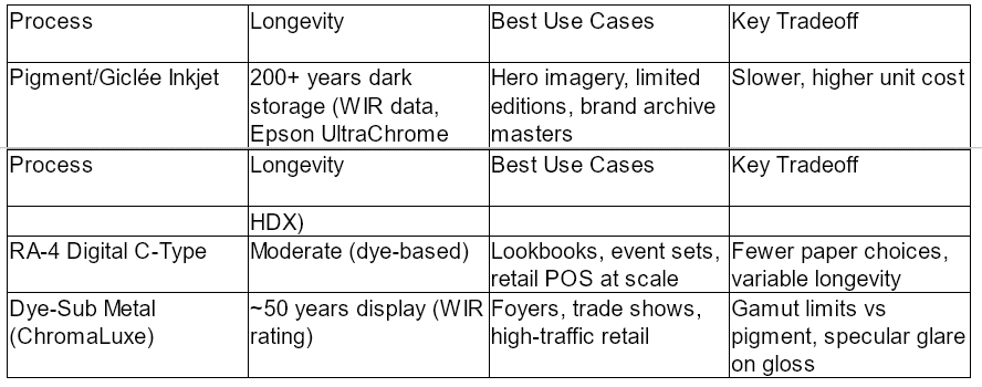
Match the process to the setting and the refresh cycle. A three-week pop-up can accept tradeoffs that would be risky for a boardroom print expected to last ten years.
Do not let the most durable process win by default. If the print will travel flat in large volumes, a slightly less permanent process with better cost and speed may be the smarter fit. The right choice matches life span, handling risk, and budget at the same time.
Pick Paper and Finish Carefully
For longer life, choose cotton rag or alpha-cellulose fine-art papers that meet ISO 9706 permanence requirements. Optical brightening agents, or OBAs, make paper look whiter at first, but they can weaken over time and shift the look of the sheet. Use OBA-free stocks for archive pieces and important masters. Use moderate OBA stocks when brightness matters more than very long life.
Gloss gives strong contrast and punch, but it shows fingerprints and glare. Lustre or satin is usually the safest middle ground for marketing work. Matte cuts reflections, which helps in bright rooms, but it can soften contrast. If sustainability reporting matters, ask for FSC or PEFC chain-of-custody paper.
Think about touch as well as appearance. Uncoated art papers feel premium in a presentation box, while resin-coated papers handle fingerprints better in busy retail settings. If the piece will be mailed, ask how the stock behaves when rolled or packed flat.
Manage Colour and File Prep
Adobe recommends 300 PPI at final size for high-quality photo prints. Some inkjet jobs can still look good around 220 PPI, depending on the printer and viewing distance. Avoid aggressive upsampling. If you must scale up, use high-quality resizing and apply output sharpening based on the paper finish.
Default to sRGB when the lab asks for it. Several Australian labs do, and some automatically convert other colour spaces to sRGB during upload. That can clip wide-gamut colour if you did not plan for it. Always embed the profile so the lab knows how the file was built.
Ask the lab for the ICC profiles for each paper and printer you are considering. Then soft-proof, which means previewing the print on screen through that profile before you export the final file. View proofs under D50 lighting, not under mixed office light, or you may approve a colour that falls apart at installation.
File prep is not only about resolution. Check crop marks, safe area, border width, and aspect ratio before export. A strong image can still fail if a face lands too close to the trim or a white border comes back uneven.
Proof Once, Then Scale
Add a control target such as a Ugra or Fogra Media Wedge to contract proofs. Measure it with a spectrophotometer and agree in advance on ΔE tolerances for brand colours and neutrals. Current proofing practice references ISO 12647-7 tolerances and the CIEDE2000 formula because it tracks human vision more closely.
Before a larger rollout, order three to five small prints of the hardest images in the set. Test deep blues, bright reds, skin tones, and neutral product shots. Approve them only after viewing them under the light they will live in, whether that is retail track lighting, daylight, or warm hospitality light.
Measured proofing is not just for galleries. It is just as useful for store graphics, menus, and direct mail because it gives everyone the same reference before hundreds of pieces are produced.
Framing and mounting matter too. The Library of Congress recommends enclosure and framing materials that meet ISO 18902 and pass the Photographic Activity Test in ISO 18916. UV-filtering glazing adds another layer of protection, and Wilhelm Imaging Research bases display permanence ratings on 450 lux for 12 hours per day. That gives you a useful benchmark for indoor display planning.
Choose the Right Print Partner
The best lab is the one that can prove its process, not just promise a nice result.
Specialist fine-art labs running pigment inkjet are usually the safest choice for long life and exact colour. They cost more and move slower, but their output is predictable. Pro photo labs that offer RA-4 C-type and inkjet hybrids are more flexible for campaign work and faster at scale.
On-demand ecommerce labs can work for small tests or lower-risk jobs, but you should vet them carefully. Ask whether they supply ICC profiles, how they proof, what lighting standard they use, how they pack prints, and what happens if colour or finish misses the brief.
Do not stop at website galleries. Request sample packs, paper lists, and proofing notes. A supplier who can explain the workflow clearly is usually easier to trust when a deadline is tight.
Local production can also make approvals easier. If a job is urgent, being able to pick up a proof, inspect it in person, and talk through changes with the operator can remove a day or two from the schedule.
Shortlist Two or Three Trusted Suppliers
Start by printing the same reference image with at least two labs on comparable stocks. Compare the results under controlled light, not near a window at noon and not under mixed office bulbs.
Run one easy image and one difficult image through each lab. The easy file shows baseline sharpness and finish. The hard file reveals how the lab handles deep shadow detail, smooth skin, and saturated brand colours.
Before you place a brand-sensitive order, spend time checking local vendors one by one, noting how clearly they describe sizes, finishes, care notes, turnaround windows, proofing options, stock details, packaging methods, sample availability, and ICC guidance for common papers used in marketing jobs, then carefully review a few local catalogues of quality photo printing services so you can compare claims side by side. That desk research is not enough on its own, but it helps you see which vendors explain their materials clearly before you ask for samples.
Ask how finished prints are packed for transport. Interleaving sheets, corner protection, flat boxing, and moisture barriers matter if work is traveling across states or sitting in a loading bay overnight.
Keep a record of every approved proof, ΔE report, paper certificate, and email sign-off. Those documents become the reference point for future reprints, disputes, and supplier changes.
Build a Simple Quality Control System
A small record system keeps reprints consistent long after the first approval.
You do not need a large prepress team to manage print quality. You need a repeatable checklist that anyone on the project can follow.
- Reference Board: Keep one signed master proof for each hero image in a light-safe folio, and compare every new run against it under D50 lighting.
- Tolerance Bands: Write down pass or fail rules for key brand colours, neutrals, and skin tones so approval is not based on mood.
- Monitor Calibration: Calibrate design displays monthly, and compare monitor output with lab proofs at least once a year.
- Environment Log: Record where prints live, including light level, window exposure, and glazing type, so replacement timing is based on risk.
- Reprint Triggers: Define clear triggers such as a paper change, a supplier change, a lighting change, or a visible cast against the approved proof.
Set a review rhythm. For permanent displays, inspect quarterly. For seasonal work near windows or heat, inspect monthly during the campaign.
This turns quality from a one-time approval into a working standard. It also makes handovers much easier when staff or vendors change.
Use Print as a Stronger Brand Asset
Print works best when it is planned, measured, and reviewed like any other brand channel.
Do not gamble your campaign on commodity output. Specify to standards, proof with both instruments and eyes, and choose a supplier who can show how the result will be controlled.
You will cut disputes, reduce reprints, and get printed storytelling that looks right on launch day and still looks right next season. The same framework works for five gallery prints and five thousand retail panels.
That discipline also gives procurement a clearer way to compare quotes. Instead of judging only unit price, you can compare proof quality, permanence data, packaging standards, and reprint support.
Start with the next brief, not the next problem. Add the spec checklist, request lab profiles, order small tests, and keep the approved proof where the team can find it.
Answer Common Print Questions
A few technical choices cause most print problems, so it helps to settle them early.
Is Giclée Just Marketing?
Usually, giclée means pigment-ink inkjet printing on fine-art media. The label alone does not guarantee quality, so ask for the ink set, paper name, and permanence data.
What Resolution Do I Need for Photo Prints?
Aim for 300 PPI at final size. Inkjet prints can still look good around 220 PPI, but lower resolution gives you less room for cropping or close viewing.
Should I Send sRGB or Adobe RGB Files?
If the lab requests sRGB, send sRGB. If it provides wide-gamut ICC profiles and clear instructions, Adobe RGB can work, but always embed the profile.
How Do I Check Colour Without a Spectrophotometer?
Ask for a proof with a control wedge. Even without an instrument, you can compare the proof with the approved standard under D50 light and catch major shifts before the full run.
Do Optical Brighteners in Paper Matter?
Yes. OBAs make paper look brighter, but that effect can fade and change the tone of the sheet over time. Use OBA-free stocks when long life matters most.
Are Metal Dye-Sublimation Prints Durable Enough for Retail?
Yes. ChromaLuxe dye-sub metal prints have achieved Wilhelm Imaging Research display permanence ratings around 50 years under test conditions, and they handle traffic and cleaning well.
What Should I Ask a New Print Supplier Before My First Order?
Request ICC profiles, a paper list, proofing details, viewing light standards, packaging specs, and the reprint policy if colour or finish misses the agreed brief.