What Illuminated Signs Actually Do to a Space
There’s a specific moment that happens on a lot of commercial projects—a client approves a sign mockup, everyone feels good about it, and then the fabricated unit goes up on the wall. And something’s off. Not wrong, exactly. Just not what anyone pictured. The proportions feel different. The glow bleeds in a direction nobody accounted for. Or worse: in daylight, it nearly disappears against a surface that looked neutral in every rendering.
This happens more than the industry admits. And it’s rarely about the sign itself.
Why Placement Beats Design Every Time
Most sign decisions start with aesthetics—typeface, color temperature, whether to go with edge-lit acrylic or exposed-filament neon. That’s understandable. Visual identity matters. But in practice, the single biggest factor in whether a sign reads well is where it sits relative to the viewer, the light sources around it, and the surface behind it.
A sign mounted at 14 feet on a two-story atrium wall will look completely different from the same sign at 8 feet in a corridor. Viewing distance changes everything. At 30 feet, fine letterforms collapse. At 6 feet, a sign that seemed bold in a mockup can feel aggressive or poorly scaled. There’s no universal rule—but there is a real gap between how signs are spec’d and how they’re experienced by someone walking through a space at normal speed.
What often happens is that designers optimize for a straight-on photograph rather than for peripheral or moving-viewer perception. Signs that look incredible in a hero shot can be genuinely hard to read from 45 degrees, which is how most people encounter them in hallways, lobbies, and storefronts.
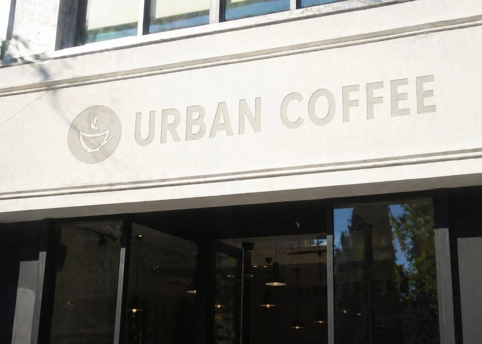
Full daylight reveals the problem: without illumination active, this sign nearly vanishes against a light concrete facade.
The Wall Is Part of the Sign
This gets overlooked constantly. The material behind an illuminated sign isn’t passive—it interacts with the light in ways that can dramatically change the outcome.
Brick, for example, absorbs and scatters light unevenly. A halo-lit channel letter on a brick facade can look muddy because the mortar joints create micro-shadows that break up the glow. It can still look great, but it requires a larger offset—more space between the sign and the wall—than the same application on smooth painted drywall.
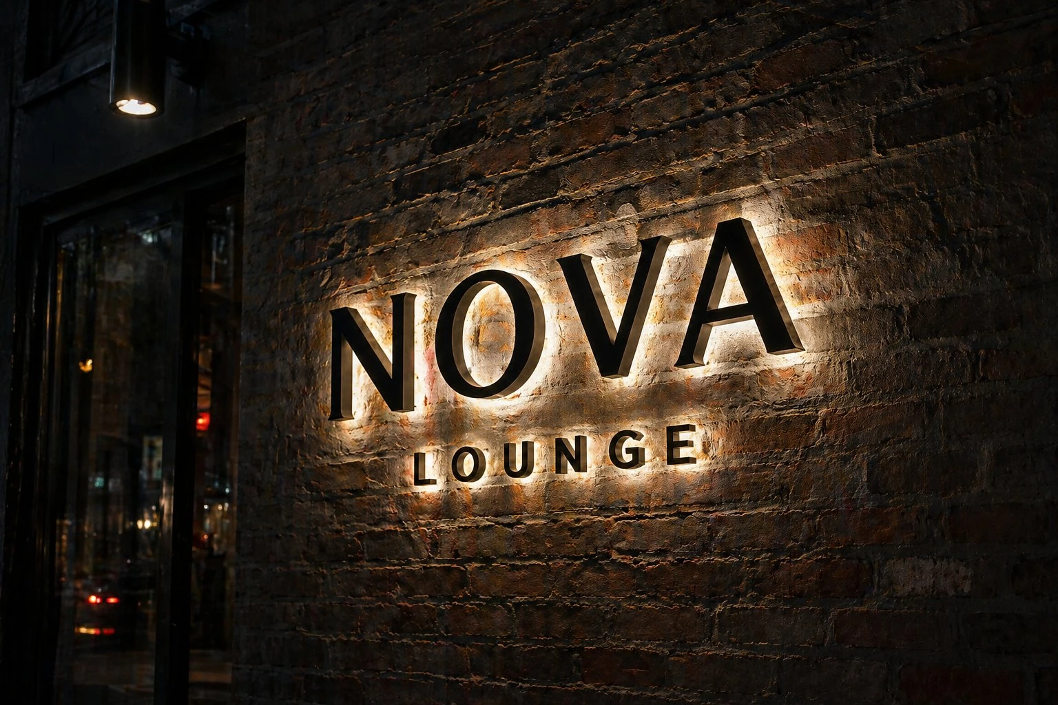
Nova Lounge: backlit letters on exposed brick. The texture scatters light in irregular patterns — which can work beautifully, but requires careful offset calibration during installation.
Glass is its own problem. Anything mounted near a glazed facade will compete with reflections during certain hours. What works at 10 AM can become nearly invisible at 3 PM when the sun angle hits the glass at the wrong pitch.
Matte-painted surfaces, on the other hand, tend to be forgiving. They diffuse the halo evenly, which is why you’ll see a lot of interior brand moments on matte walls. It’s not always a style choice—sometimes it’s just the most predictable outcome.

Oasis Wellness Suites: halo-lit letters on a smooth, light-toned interior wall. Matte surfaces diffuse the glow evenly — this is why interior hospitality installations often look more refined than exterior ones.
Brightness Is Not the Same as Legibility
Most people assume brightness solves visibility. In practice, it often does the opposite.
A sign that’s too bright in a low-ambient environment creates contrast so severe that the eye struggles to resolve the letterforms. The glowing element dominates, but the actual content—the name, the message—becomes harder to read, not easier. This is especially true with certain high-density LED formats that use tight module spacing behind translucent faces. The output looks impressive on a spec sheet. In an intimate restaurant or boutique retail space, it can feel clinical, even aggressive.
The more useful question isn’t “how bright?” but “how much contrast relative to the surrounding surface, at the expected ambient light level?” A warm 3000K halo against a dark wall at dusk is often more legible—and more compelling—than a 6000K face-lit box in the same location.
Dimming matters here, too. Signs that can’t modulate their output are stuck performing for one lighting condition. Most real commercial environments cycle through several in a single day.
Day and Night Are Basically Different Signs
This is one of the more non-obvious things about illuminated signage: a well-designed sign for daytime is not automatically a well-designed sign for nighttime, and vice versa.
During daylight, ambient light is the dominant force. A sign needs to be readable against sky brightness, competing light sources, and visual noise from surrounding architecture. This often means prioritizing color contrast and physical size over luminosity.
After dark, the calculus flips. The sign becomes its own light source. Now the questions are about spill, halo radius, and whether the illumination is drawing the eye to the right place or creating a hot spot that overwhelms the surrounding context.
In real projects, this means a single sign may need to be evaluated—and sometimes adjusted—for both conditions. Drive-bys at noon and at 9 PM can reveal completely different problems.
Where Different Technologies Actually Perform
Exposed neon—or its modern equivalent, flexible LED neon—does one thing very well: it creates a sense of warmth and presence that’s hard to replicate. Custom neon signs tend to read as intentional and crafted, which is why they work in hospitality contexts where the brand wants to feel considered rather than corporate. The tradeoff is daylight visibility. Neon is night media. It earns its keep after dark.
Backlit acrylic and lightbox formats are more versatile across conditions but require careful attention to face opacity. A translucent face that’s too thin will show the LED dot pattern; too thick, and the brightness drops below useful levels in lit environments.
Channel letters—particularly those with returns painted to match or contrast the wall—are probably the most reliable all-condition performers for exterior retail. They read in daylight because they have physical depth and shadow. They read at night because the illuminated face or halo has real output. The failure mode is usually installation: inconsistent letter spacing, or a raceway that wasn’t accounted for visually.
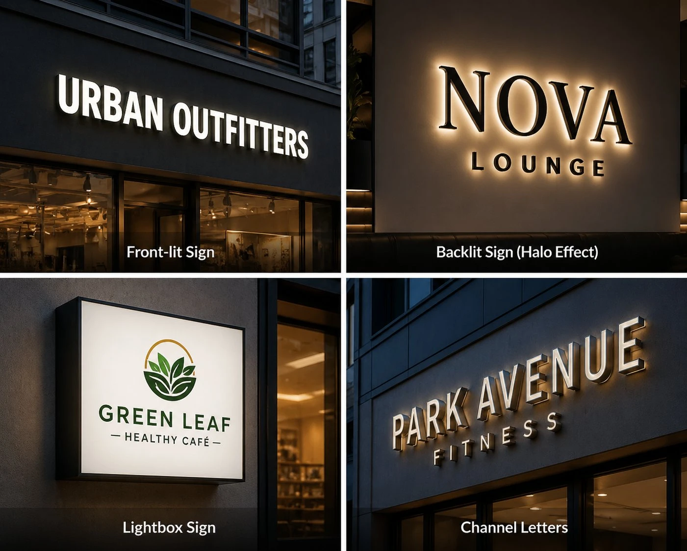
Four common formats in real exterior conditions: front-lit channel letters, backlit halo signage, lightbox displays, and dimensional channel letters. Each performs differently depending on wall material, ambient light, and viewing distance.
Before You Finalize Anything
Check the wall surface and the ambient light levels at different times of day. If possible, visit the location at the actual hour when foot traffic peaks. Walk the approach path—don’t just stand in front of the wall.
Get clear on the primary viewing distance. Is this a street sign read from 50 feet by someone in a car, or an interior wayfinding element seen from 10 feet by someone already inside? They’re completely different briefs.
Ask whether the space will change. A sign installed in a bright, high-ceilinged retail environment might perform perfectly—until a tenant adds pendant lights that create competitive glare, or the space gets subdivided and the viewing corridor shortens.
The best-performing illuminated signs in commercial spaces aren’t always the ones with the biggest budgets or the most sophisticated technology. They’re the ones someone looked at carefully before fabrication, in the actual context they were designed for.
That step gets skipped more often than it should. Reviewing options on-site, across different times of day and under real ambient conditions, tends to surface problems that no rendering will catch. It’s not a complicated process—it just requires treating the space itself as part of the specification, not an afterthought.
Editorial piece on commercial signage and lighting installations.
About the author
Dmytro Andrukhov is a Chicago-based artist and designer working with LED neon and illuminated signage across commercial and interior spaces. His work focuses on how lighting behaves in real environments — not just in visual concepts.


.jpg)